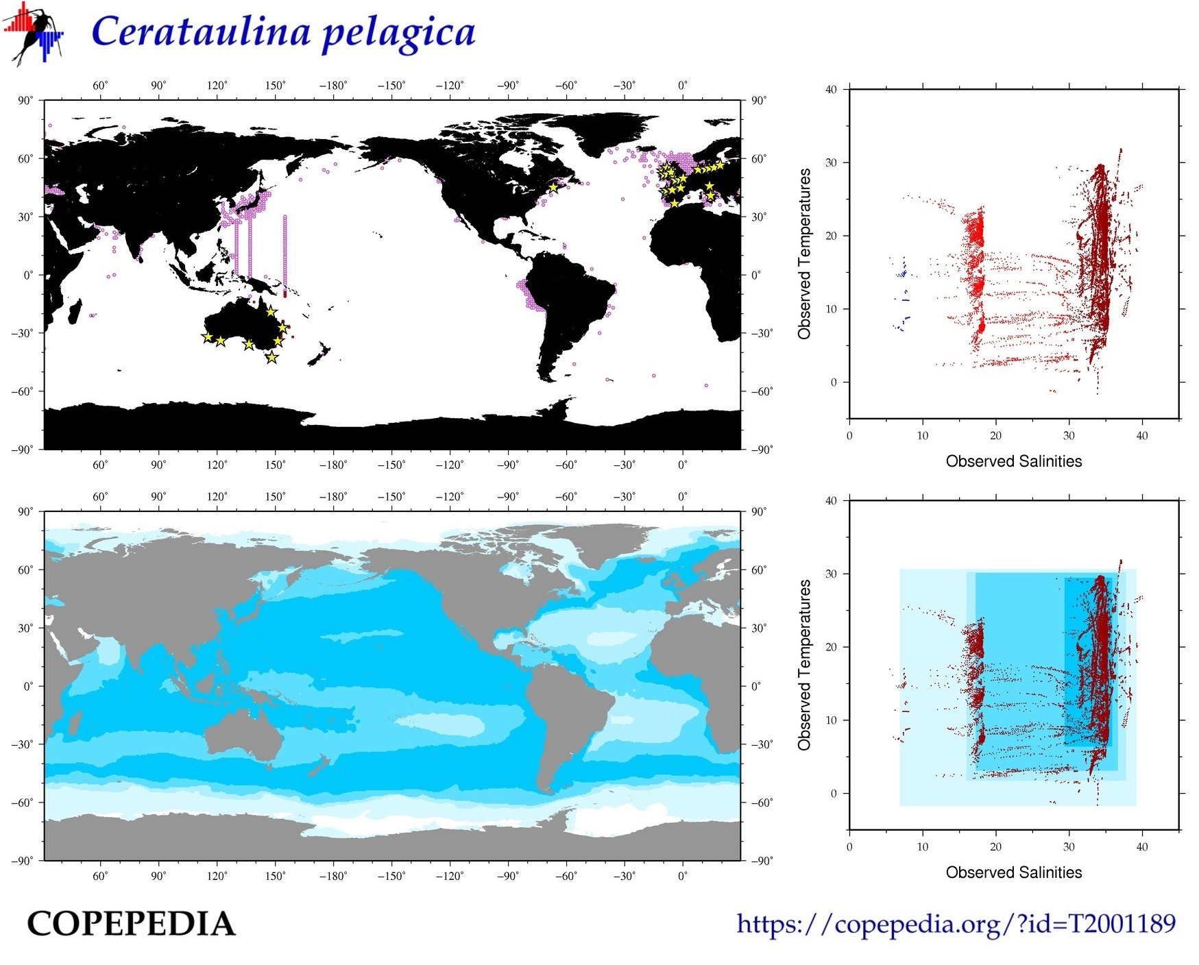
The Observed/Theoretical Niche Map above has four sub-figures:
- The upper left sub-figure (observed distribution map) shows locations were this taxa has been reported/observed in the ocean. This is based on observation data from COPEPOD and its associated projects.
- The upper right sub-figure (associated temperature-salinity pairs) shows the average temperature and salinity values found at each geographic location where this taxa was observed.
- The lower right sub-figure adds blue-shaded boxes to the upper right figure which indicate the temperature-salinity ranges associated with 70%, 90%, 95, and 99% of the observation temperature-salinity values. For example, the darkest blue box represents the temperature and salinity values range associated with 70% of all temperature-salinity pairs associated with the taxa observations. It was calculated by numerically sorting all of the temperature data and salinity data (individually) and then removing the lowest 15% and highest 15% of those values. This removed 30% of the available values (15% + 15% = 30%) and the remaining values are used to determine the "70% value range" for each temperature and salinity, as shown with the dark blue box in the lower right sub-figure.
- In the lower left theoretical niche map, the 70%/90%/95%/99% temperature-salinity ranges (and their blue shading) are applied to a global map of temperature-salinity values, effectively showing the best-match regions where this taxa would find favorable living conditions (based on temperature and salinity ranges).
For any region on this map, the darker the blue shading the better the fit that region has with the observed temperature-salinity pairs associated with this taxa.
USE WITH CAUTION:
- If actual observations for this taxa (shown in the upper left map) do not currently exist in a blue-shaded region (shown in the lower left map), this could be because COPEPOD currently does not have observation data from that area. Taxa with very few observations, especially if they also come from a very small geographic region, may result in a theoretical niche that is smaller than "reality" (and would/will expand as new observation data are added).
- If the obserations include "bad data" (e.g. an incorrect species identification), it can corrupt the temperature-salinity pairs used for the theoretical niche map and make the area falsely too large.
- It is also possible this is a real-world phenomena, perhaps because geographic and biological barriers are preventing that taxa from expanding into those oceanographic areas. A nice example of this phenomena is found in the cold water copepod Calanus finmarchicus (T4000005), whose theoretical niche goes strongly into the North Pacific and Southern Ocean, but who is well-known to only be found in the North Atlantic and Arctic regions. (Of course this may change when all of the Arctic ice has melted.)
|